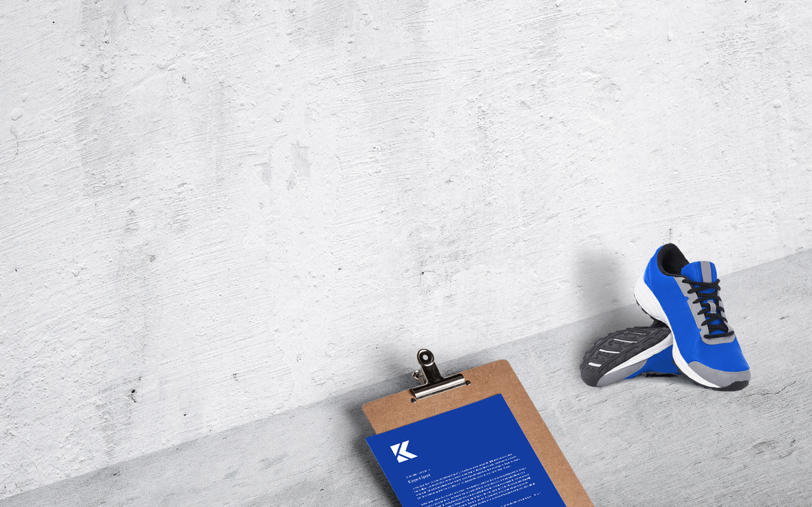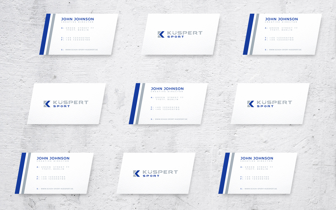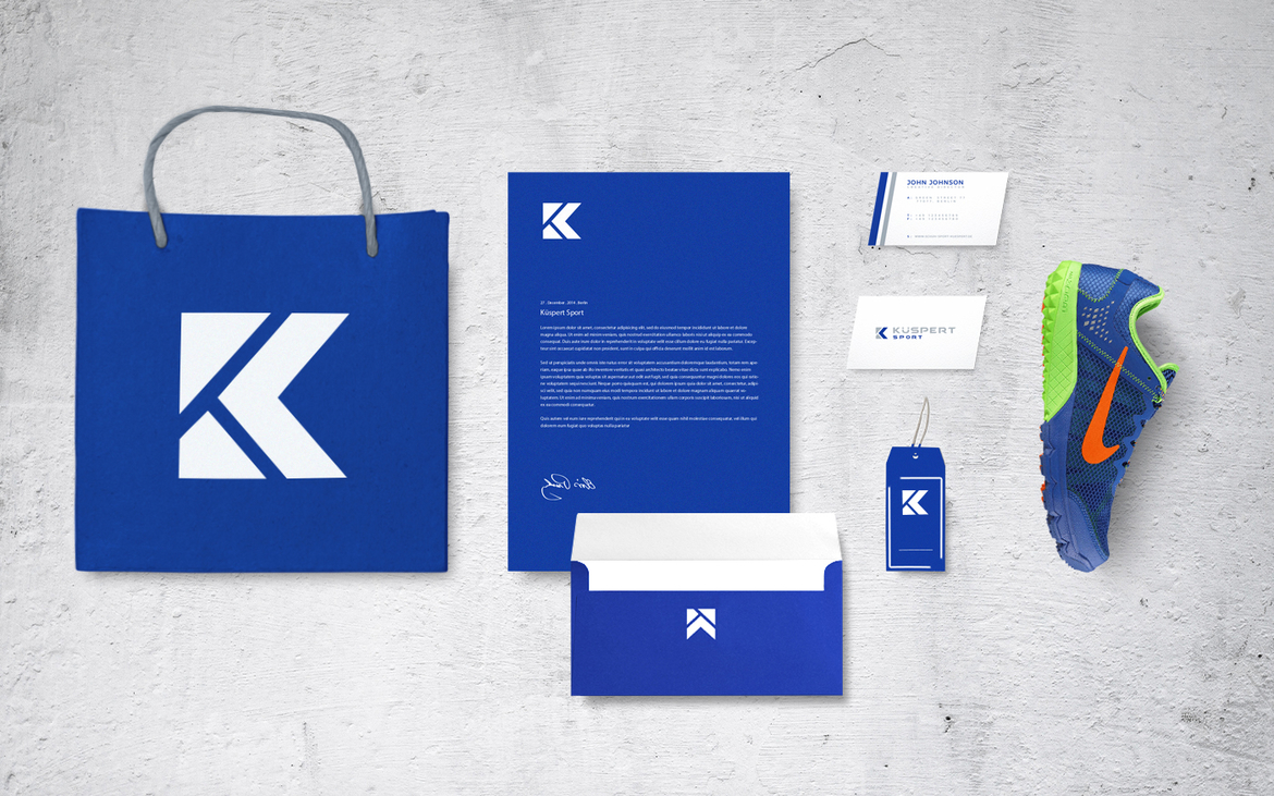
Client
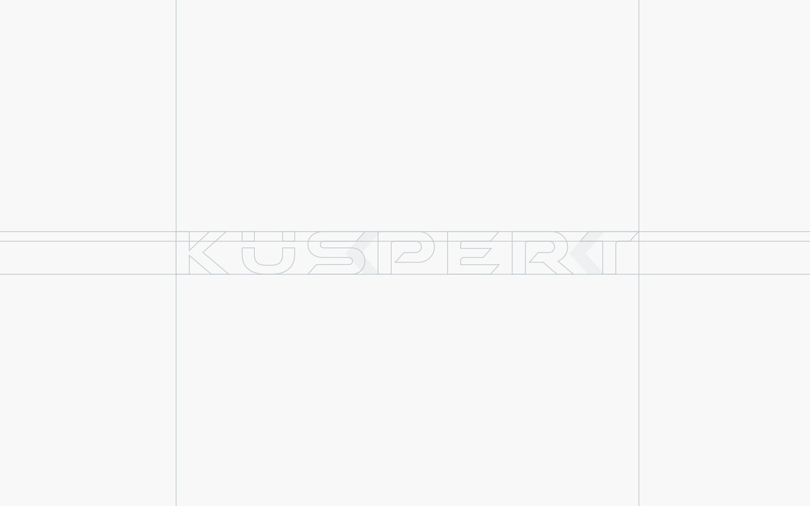
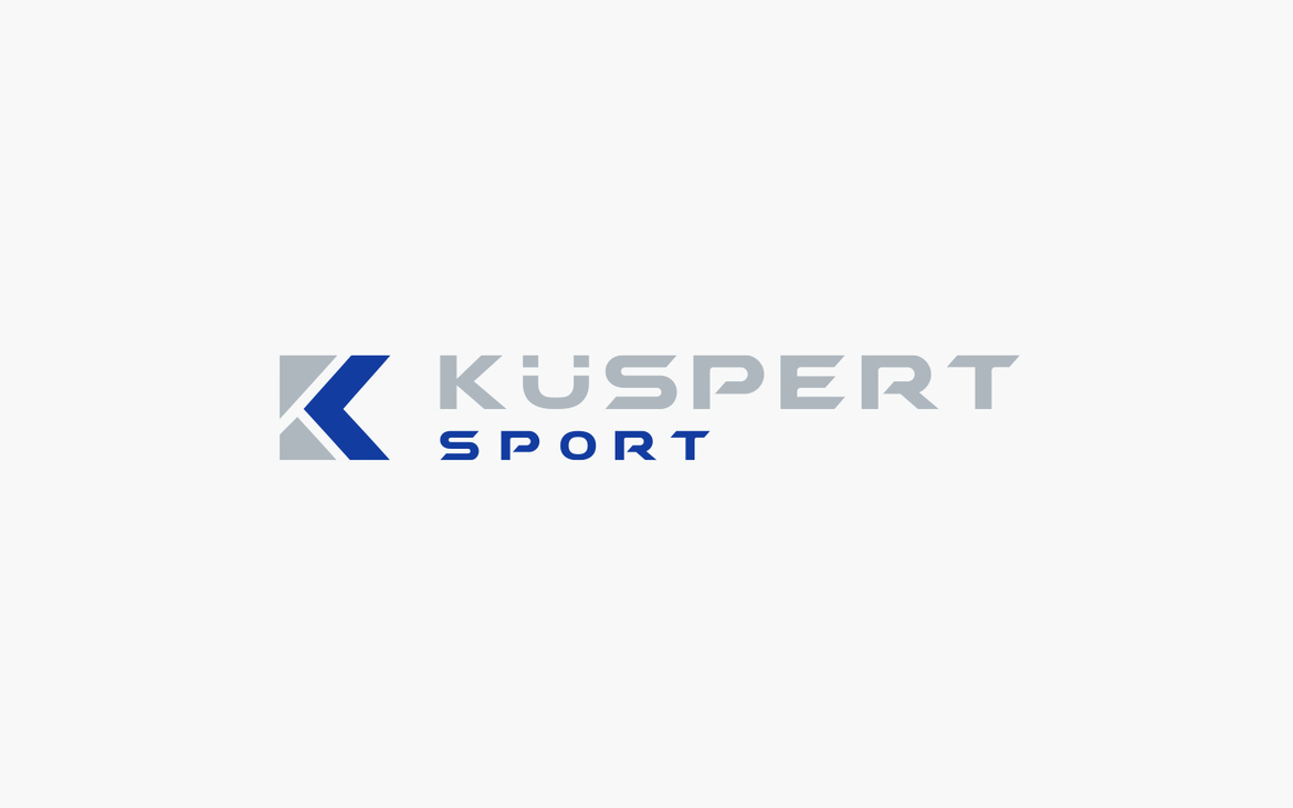
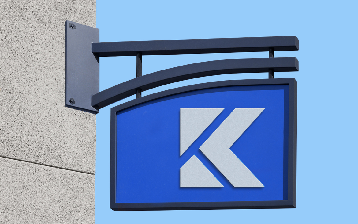
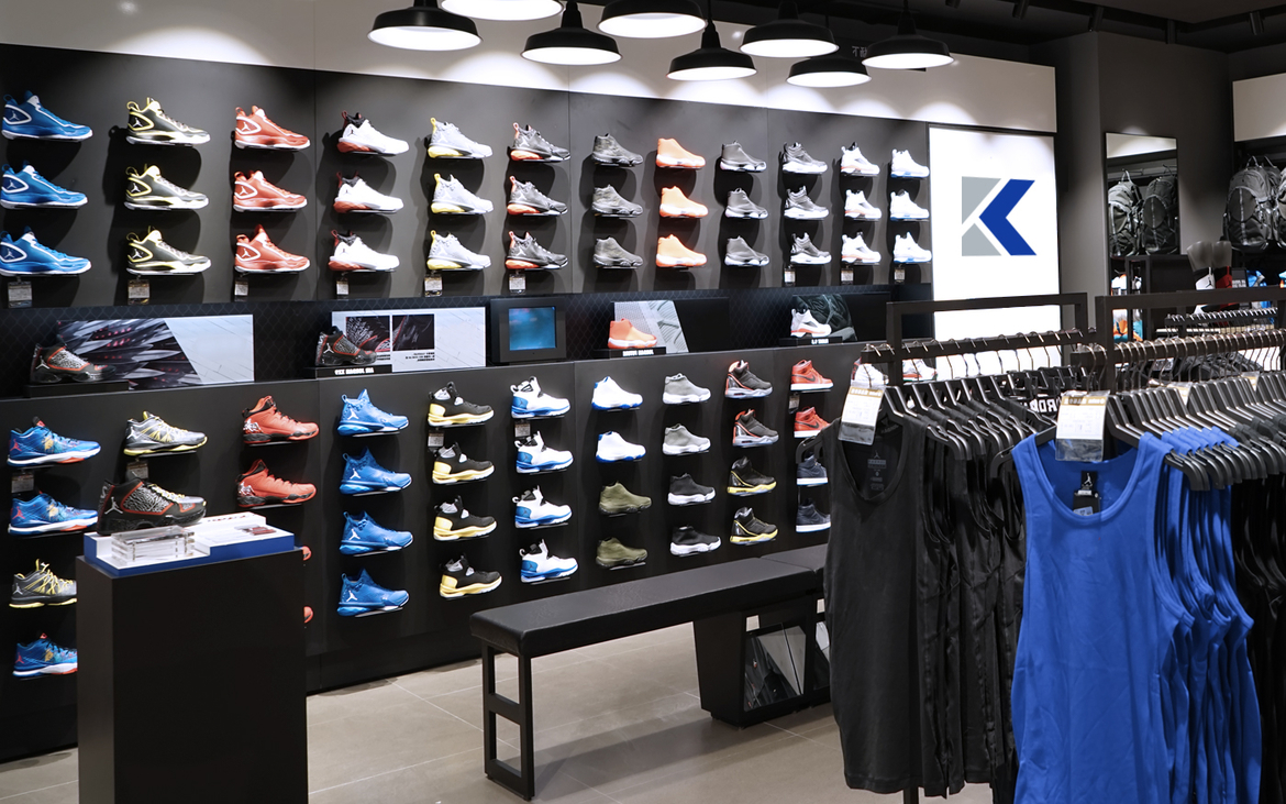
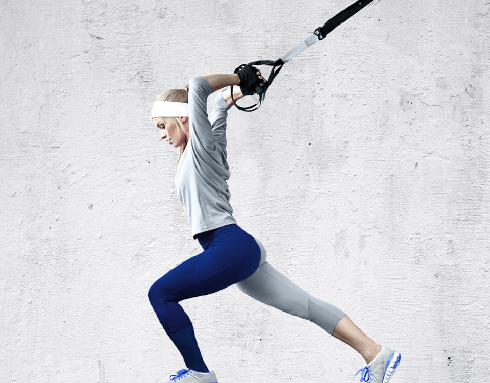
Küspert – Passau based Sportswear retailing company serving the german market in 4th generation, for over 110 years. As a retailer for footwear and sporting goods the company’s goal is to deliver its clients the best products in the market meeting their expectations at the highest level.
Project goals
The project goal was to develop the Logo/Logo Mark, which would symbolize the company products, its history and high service level.
Creative solution
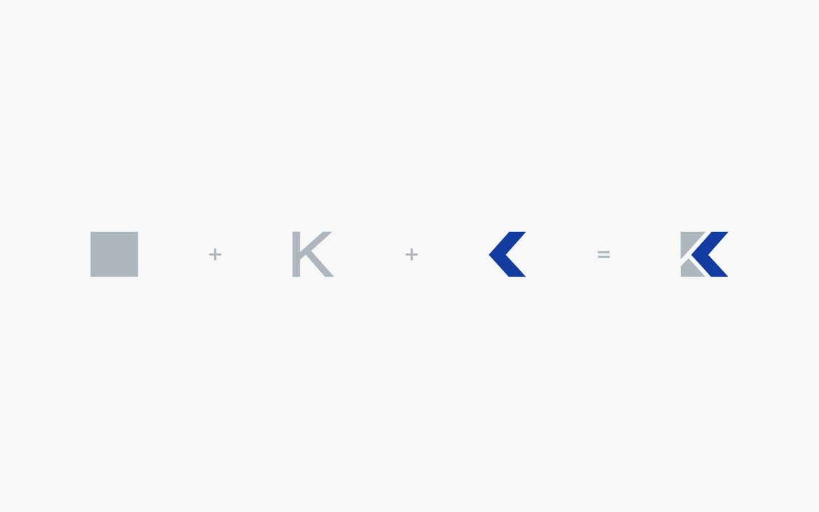
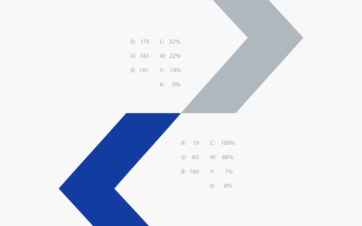
As a result of long time brainstorming, the creative solution was found to be based on the main letter “K” and the symbol reflecting the industry in modern, creative way. The symbol was meant to deeply communicate the company products and be quite simple at the same time, making the logo easy to recall. The solution was based on the concept of bent knee, as a symbol of active sport, and the box, which is the symbol of delivering the active life to the customers. This way the creative logo was developed, keeping the brand equity of blue color in itself, and developing a new base for easy, effective brand development in the future.