Client
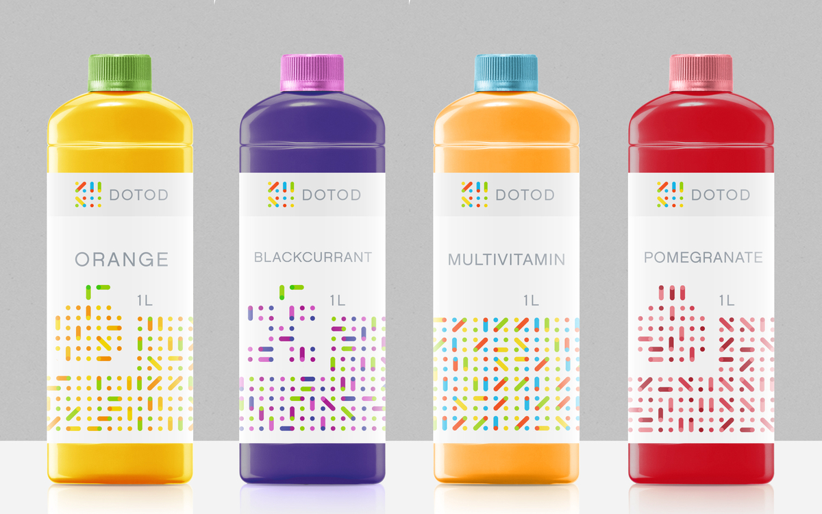
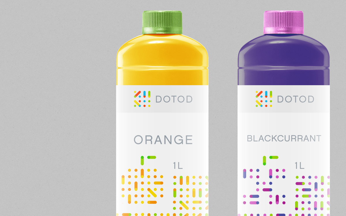
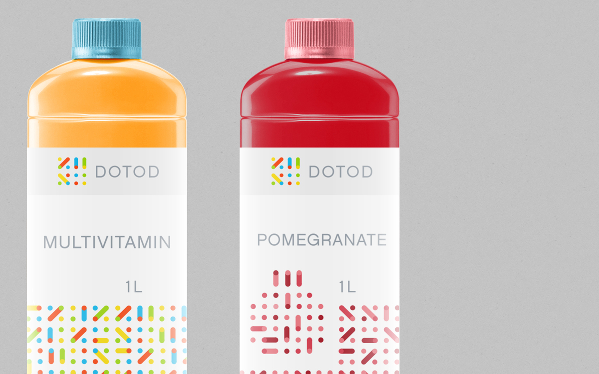
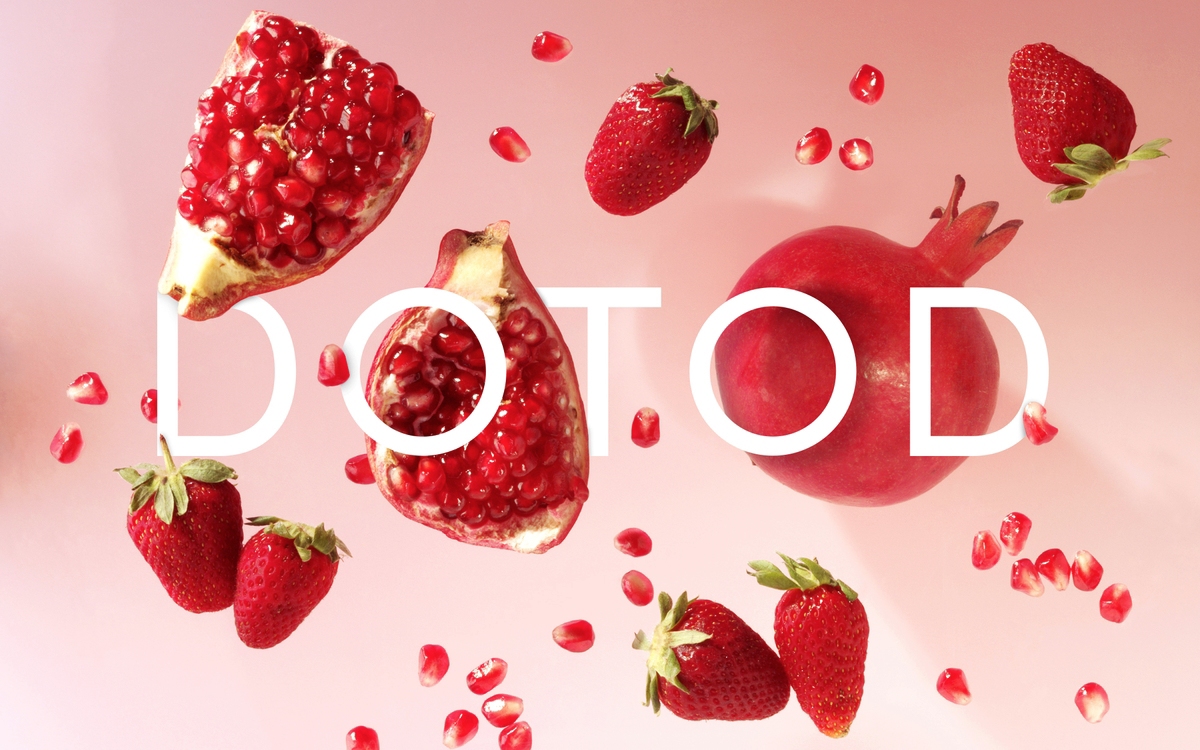
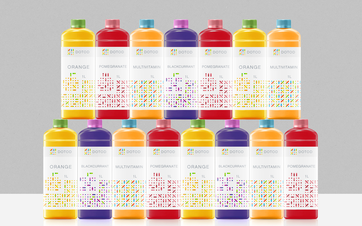
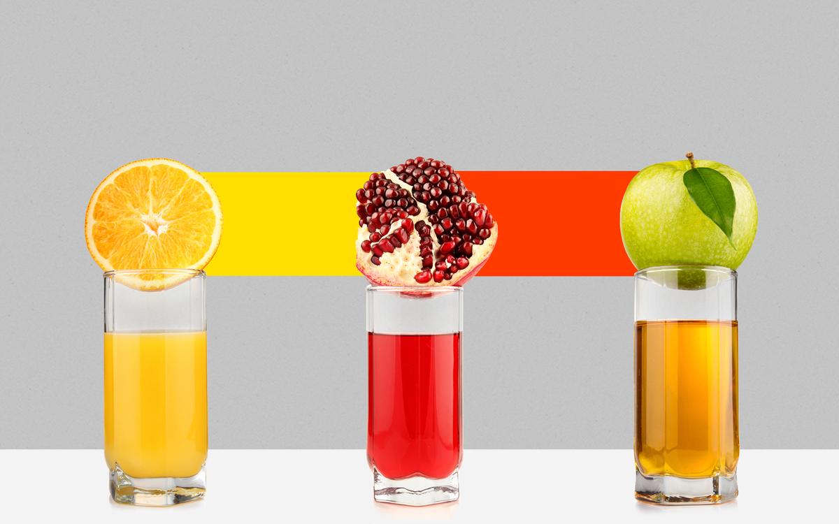
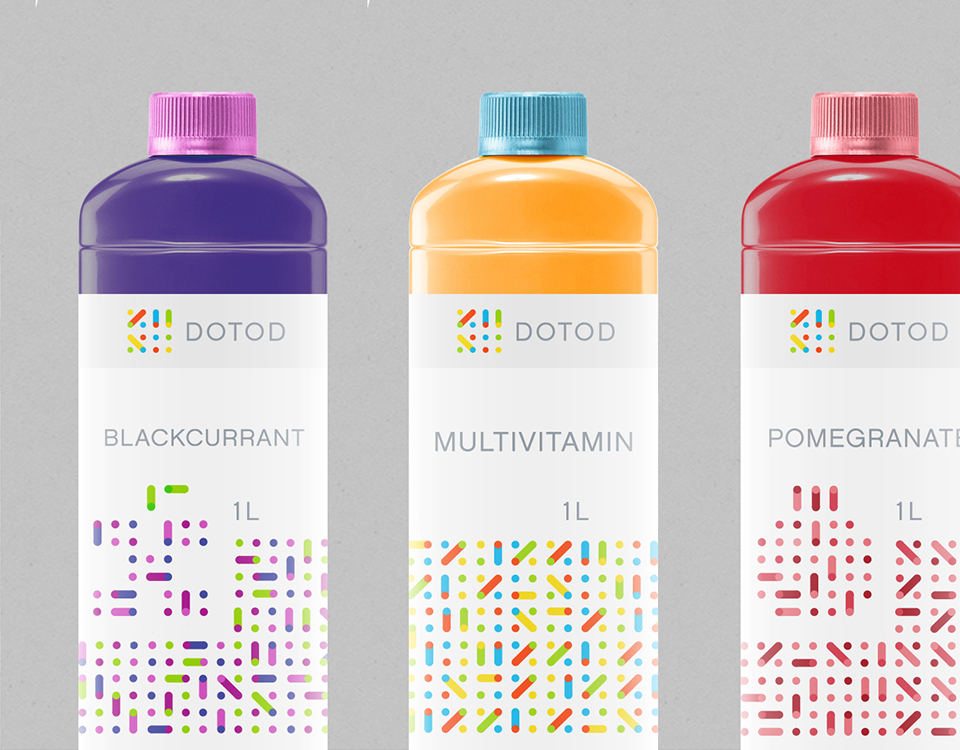
DOTOD is a new brand of fruit juices from Munich, Germany.
Project goals
Communicate the company values and philosophy through its Identity, thus establishing a Brand Equity.
Creative solution
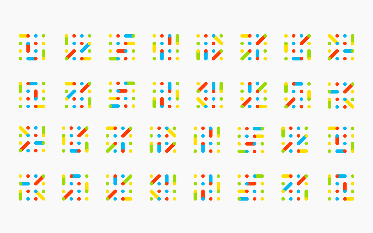
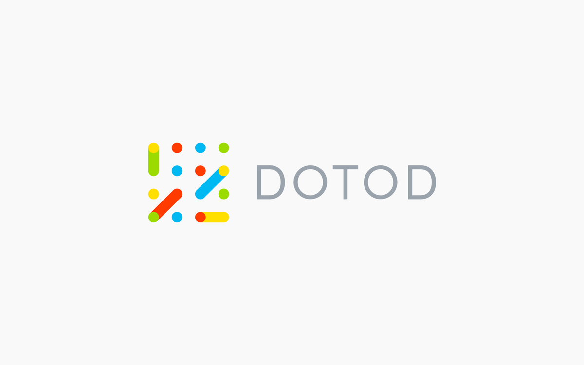
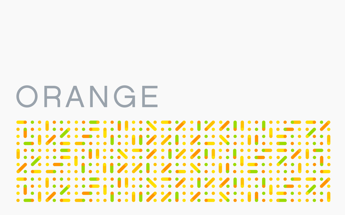
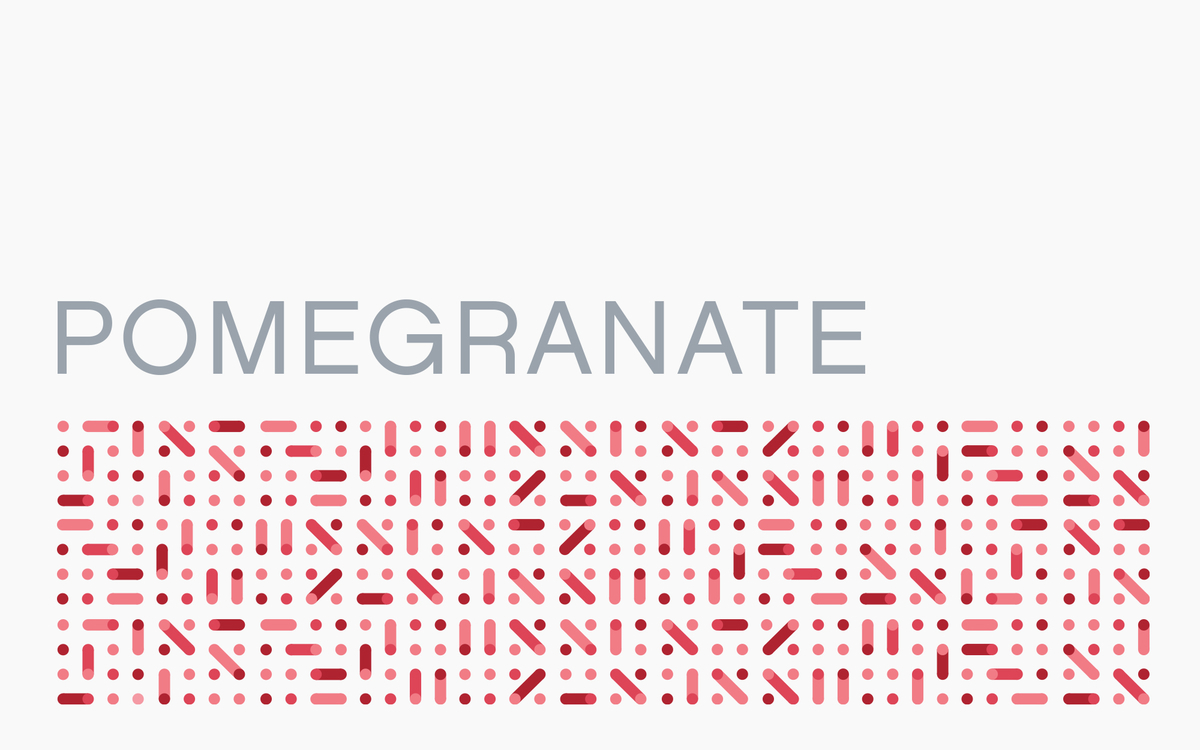
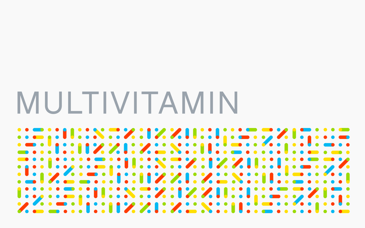
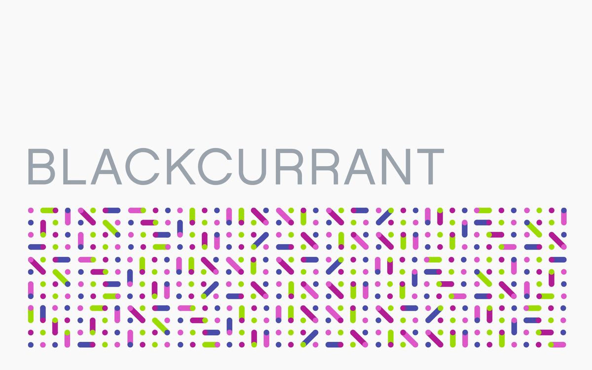
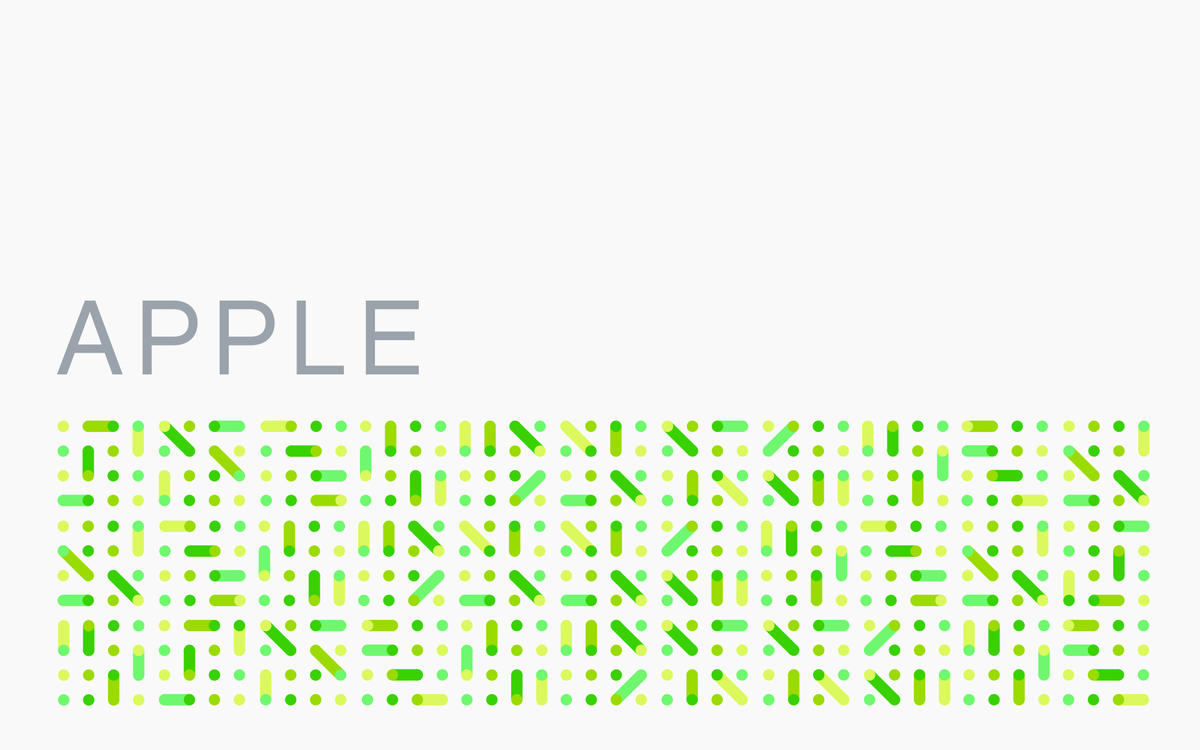
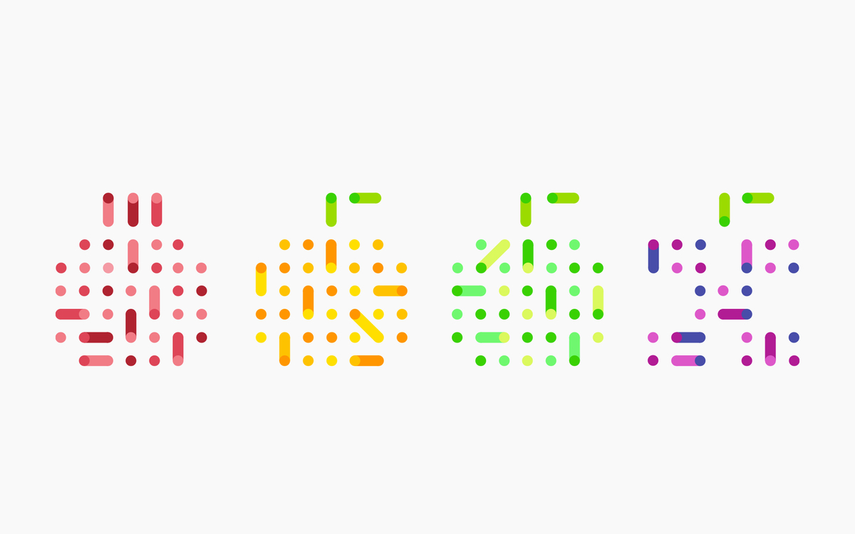
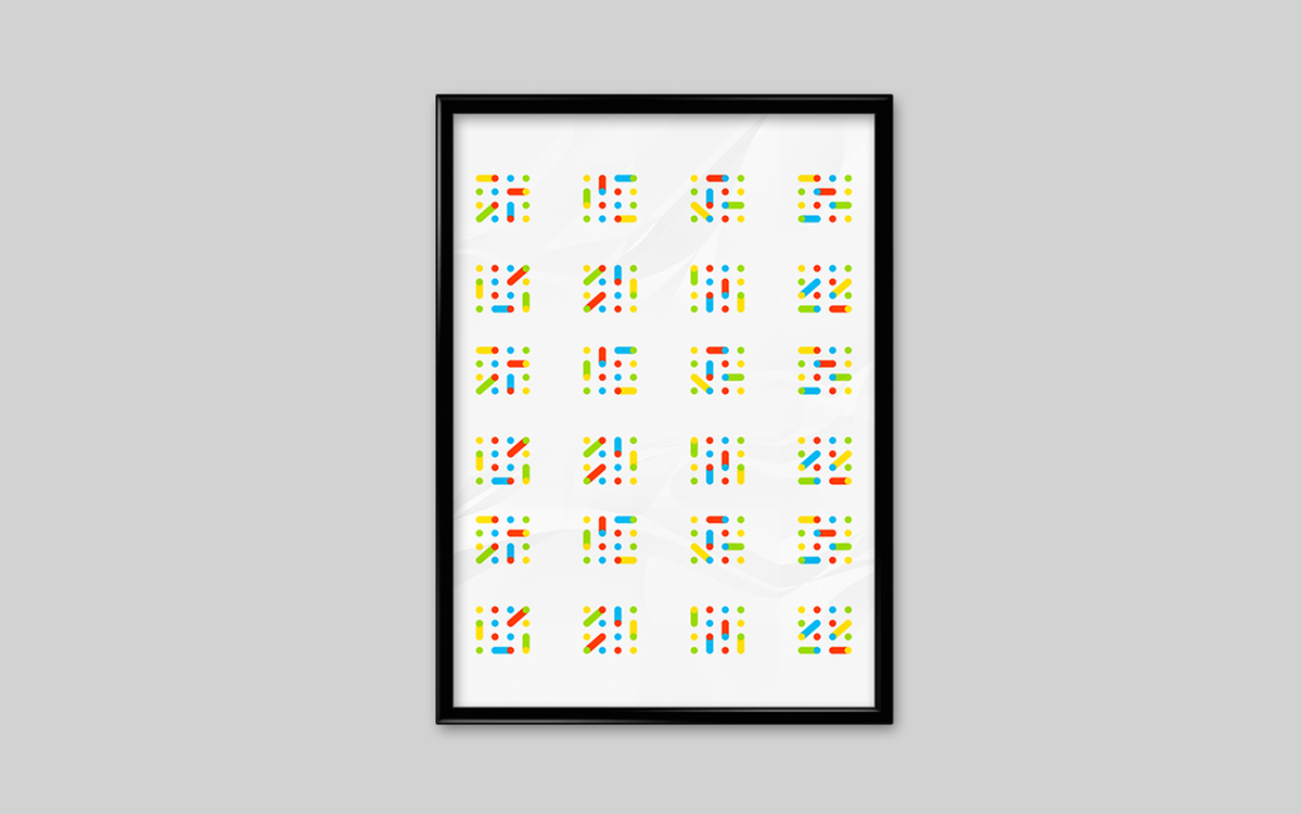
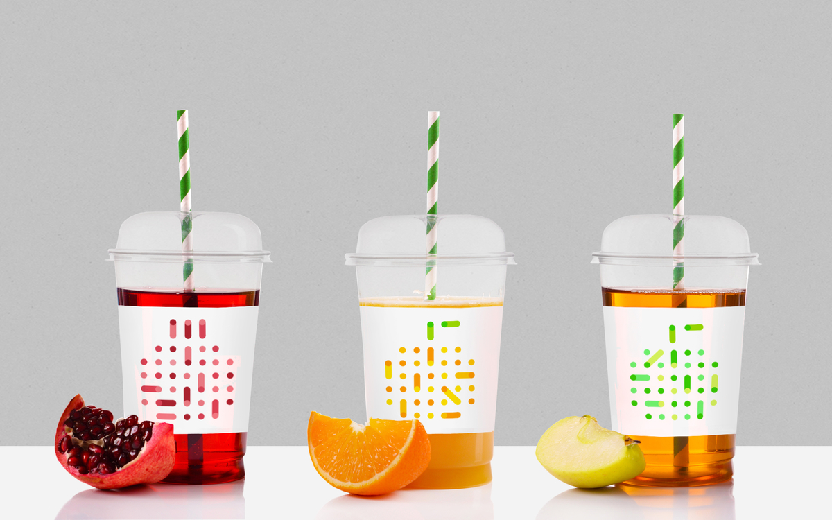
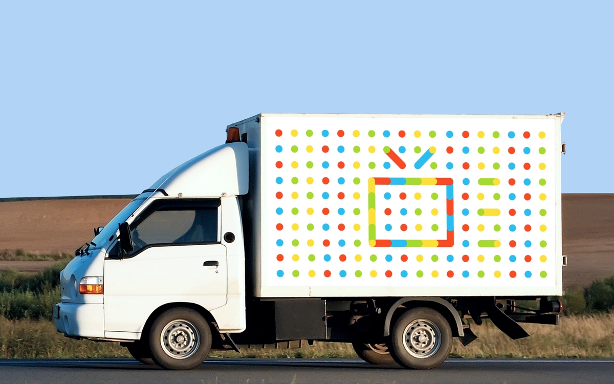
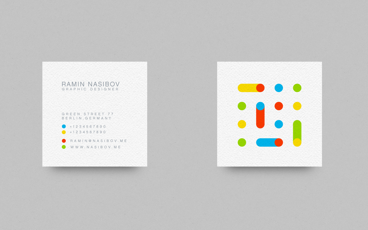
These drinks are first of all healthy and full of various necessary vitamins. I embodied this idea in multicolor dots, developing individual patterns and color palettes for each sort of fruit. Besides, the company describes itself more as a youth brand. To put this aspect into practice, I used the key associations with the present-day young generation, which include constant movement, changes, and communities. That is why the dots in the symbols are connected, each time in a different way but the idea staying the same. Thus, the concept becomes more unique and dynamic at the same time.