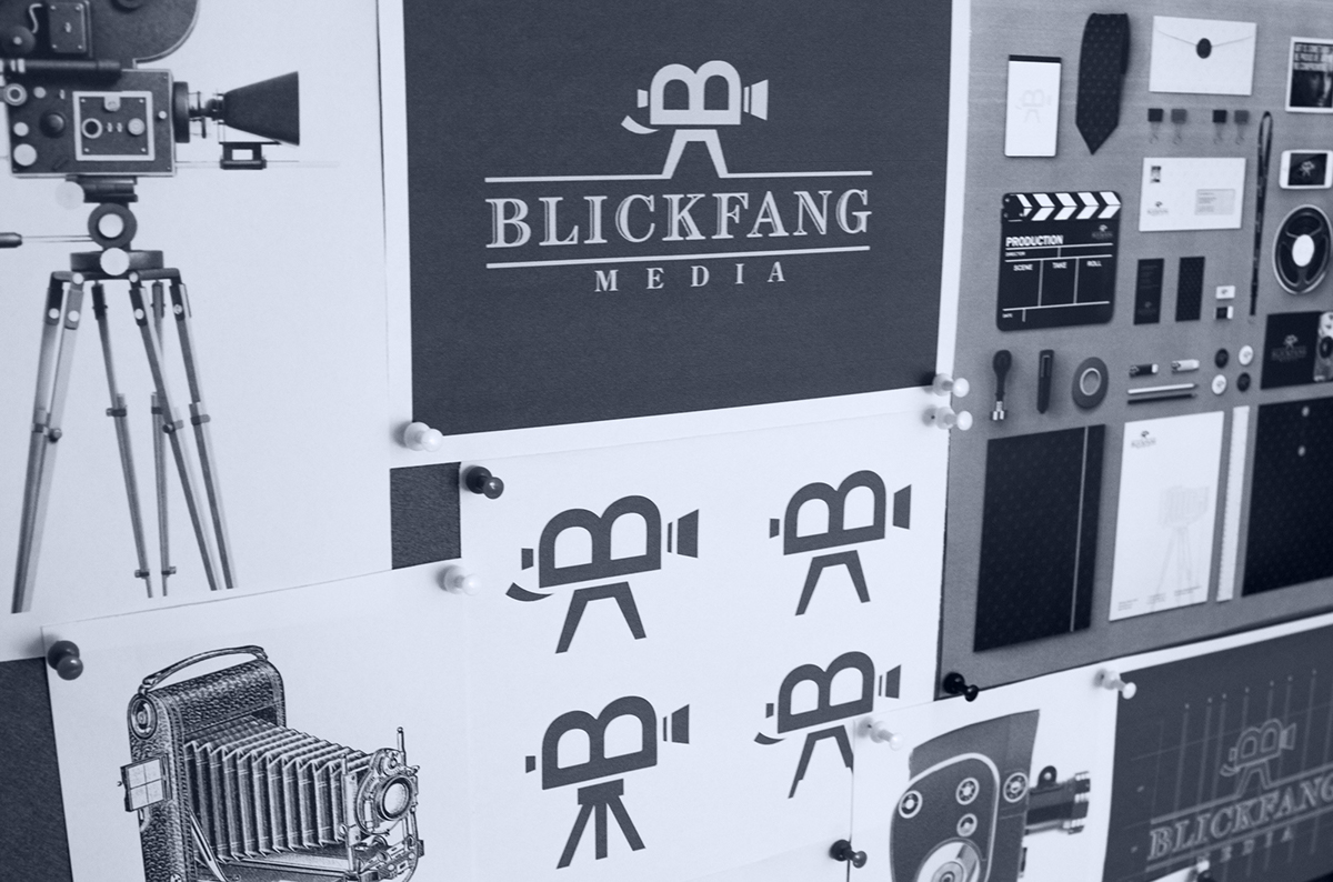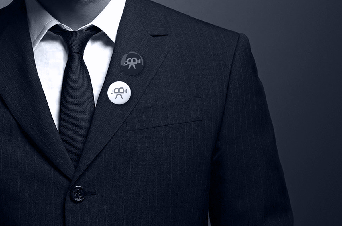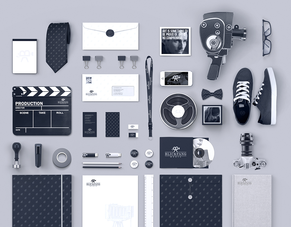
Logotype and corporate identity for “Blickfang Media” based in Munich, Germany.
The client wished the logo concept to be quite simple symbol and at the same type very easy to comprehend and stick in memory. The main concerns of the client were the color range and the font selection, which would perfectly balance and be appropriate for the corporate positioning.
Idea:
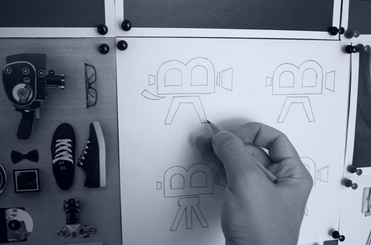
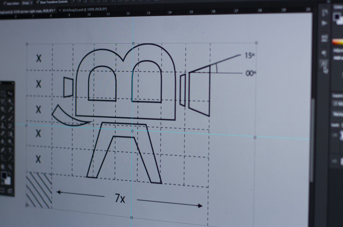
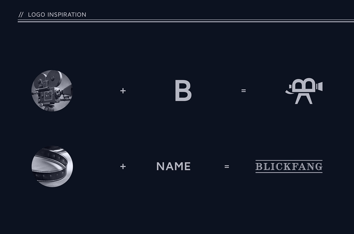
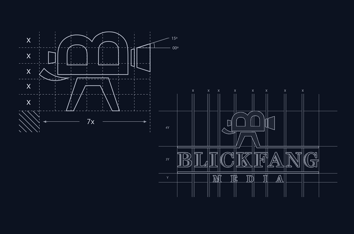
The Idea of the Logo Symbol was match the “B” letter with the Vintage Camera in a creative manner. After several variations and alterations of the Idea, I decided to combine the “B” letter(first letter of the company name) with curves of the camera tape rolls. As you can see the parts perfectly and practically match each other.
The text part of the logo is pretty simple and practical at the same time. The up and down frame lines stand for the film tape, thus the text in the logo concept is not just the naming, but also very practically fulfills and integrates into the concept philosophy.
Concept:
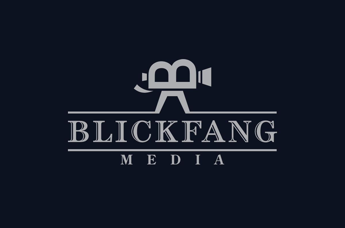
The finished logo concept consists of two separate thematically connected details, which perfectly match in one orriginal and simple idea and meets the client’s needs in a best way. The simplicity of the concept makes it easy to remember and provides the fast visual involvement of the viewers, thus creating an efficient base for further brand marketing.